Creating a logo, while it may seem simple in theory, could end up causing you lots of unnecessary headaches. A great way to avoid this is to remember the following tips.
1) Simple Designs Stand Out
While deciding on a logo for your business it is important to remember that the most memorable and iconic logos are actually very simple. Think about businesses like McDonalds, Target, and Apple. All of these big name brands have logos that are made up of simple lines and curves with few colors used. It is no coincidence that this is the case. Psychologically the more simplistic a design is, the less time it takes for the mind to process it allowing a quicker emotional response. When a logo is too complex, it takes longer for the mind to process resulting in a much less impactful emotional trigger.
2) Questions your designer will ask when creating your logo
When working with a graphic designer, it is common for these questions to come up.
- Who is your client?
- What makes your company unique?
- What does your company value?
- What image do you want to give off to the public?
- What colors would best represent your brand?
3) Your business is unique so your logo should be too
Being unique is a very important quality you want to preserve. The best way to do that is to reflect your business style with your logo.
What Type of Font Should I use?
Fonts reflect your business more than you may expect. Think about if a law firm used comic sans to represent their business, you would not take them seriously because that font does not emulate the serious nature of a law firm. Pick a font that matches what your business does.
No Arches
Whether it’s through, above, or below your brand, this trend has been repeated by too many companies to count.
Avoid using a globe
If a company is trying to portray themselves as a worldwide brand, they will most likely fall into this category. This means that this design had been done hundreds of times and if you try to come up with a variation of this, it’s probably already been done before.
Stay Away from Following Trends
Just because it is popular now does not mean it will be later. Following current trends will cause your logo to look dated and require a redesign as soon as the trend of the day dies.
Don’t Try This at Home
Making your logo by yourself or having a friend do it may seem like you are saving money but in the end it will cost you. It’s important to remember that a logo is a reflection of your business. If your logo looks amateur, your business will look amateur. Potential customers will not take you seriously causing you to lose business and money.

4) Choosing color for your logo
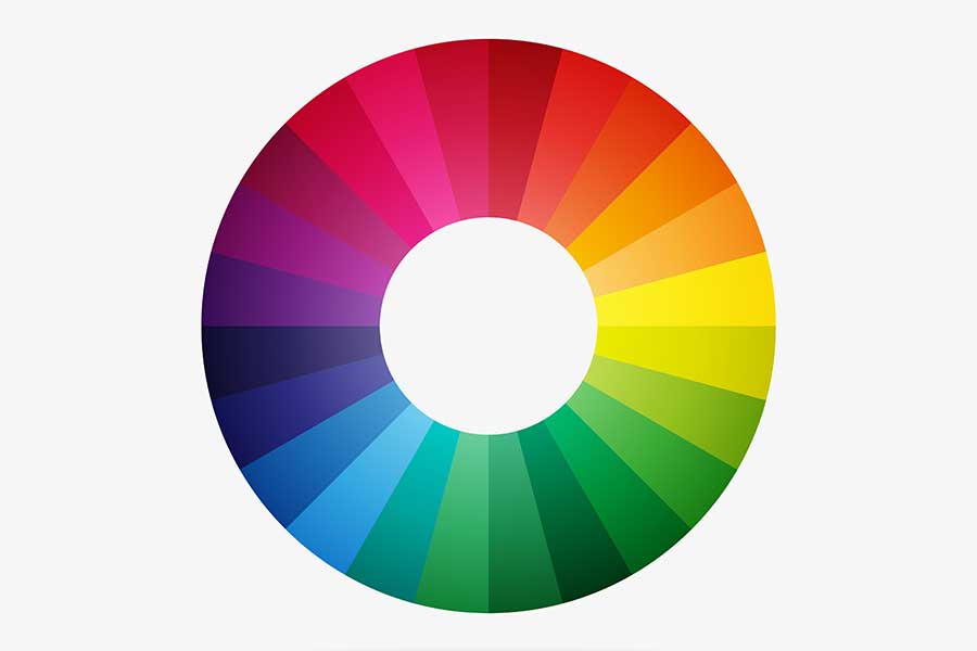
Color is quite possibly the most important part of a logo. It conveys emotion as well as the intention of your brand. Psychologically people have been conditioned to perceive colors to represent different things. For example, red represents passion, a negative bottom line and energy while blue represents dependability and trustworthiness. Yellow represents happiness and friendliness, green represents nature and earthiness, black could be perceived as sleek or modern, and gray has a more serious or mature tone.
No major businesses choose the colors to represent their brand randomly. Take McDonalds for example, they’re logo is yellow and red. Those colors were deliberately chosen from all other colors because in the fast food industry, the color red attracts attention and entices hunger while the yellow is perceived as friendly and inviting. These messages are delivered without ever saying a word. If their logo was brown and black the subconscious messages given off would be completely different. So while deciding on a color for your brand, think about what message you want to send out to the public.

